
Tracy Aviary
Accessibility Redesign

Tracy Aviary and Botanical Garden
Project overview
As a group project during the 2022 UX/UI bootcamp, I was part of a team that redesigned the admission, donation, and membership flows for Tracy Aviary, a bird Sanctuary located in Salt Lake City, Utah. Though this project was for practice, I gained much insight redesigning for broader accessibility in a real world scenario.
My Role:
UX Designer
Tools used:
Miro, Figma, Google, Adobe Creative Cloud, Trello
The Problem
Tracy Aviary is a non-profit organization that thrives off of daily admission sales, yearly memberships, and private and public donations. During our user surveys, we noticed the current layout of the website was causing frustration and confusion resulting in most users dropping off instead of completing a transaction.
The Goal
If we can aid the aviary’s site donation and daily admission flow for optimal readability, then we can optimize user retention across the site, which gives Tracy Aviary the opportunity to more clearly emphasize the great benefits that come with yearly memberships and donations.

BEFORE
Donation form
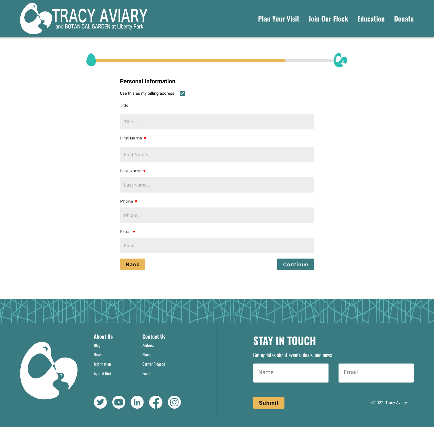
AFTER
Donation Form
Research
At first glance, the site looks properly taken care of
Obvious recent UX/UI redesign, showcasing the birds with gorgeous imagery
As I clicked through the site, I noticed:
Link to admissions page was regularly disabled, without a public notice
The site navigation bar was duplicating the exact same information as the header, which seemed unnecessary
The patterned buttons did not pass AAA or even AA compliance
Layout shifted drastically for each check out page for membership, donation, and admission pages, namely the header, body, and footer.
I wanted to know what the users of this site were experiencing, so I turned to that trusty side-kick, Google Forms and declared "It's survey time!"
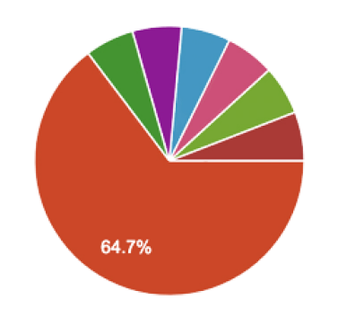
Out of 19 responses, 64.7% of users purchased tickets at the boxoffice and 0% purchased tickets online.
I wanted to know why there was this large discrepancy.
User Insights
Users reporting back that the ability to purchase admissions online was sporadic throughout the day/week
Whether this was due to routine maintenance or error, it was never clear
There was no communication with the public; unable to contact a share holder or staff
No use of grid on donations page was causing confusion
Users dropping off without completing donation or admission
Users said images, buttons, and bright colors are lovely, but also proved overwhelming during navigation, the buttons in particular were hard to read
Definition
User flow
Reiterated user flow for admission
Projected user flow for donation - adjusting layout to fit a 12 column grid
User Journey Map
Our user persona is named David. He is going to purchase admission online. Here is the ideal flow for a typical user like David:
Now that David is a member of Tracy Aviary, he has full access year round, including other great discounts.
Ideation
My team and I synthesized the results of a Like/Wish/What If scenario into a Feature Prioritization Matrix. We determined those features the redesign must have in the next iteration, while bearing in mind we had limited time to accomplish the goal of: getting users to purchase admissions in advance
Grid out donations page
Membership prompt during admission checkout
AA compliance: replacing light green color and removing the pattern on the buttons
Replacing the side navigation with breadcrumb
Add a link to admission page from the admission tab from the homepage

Wireframes
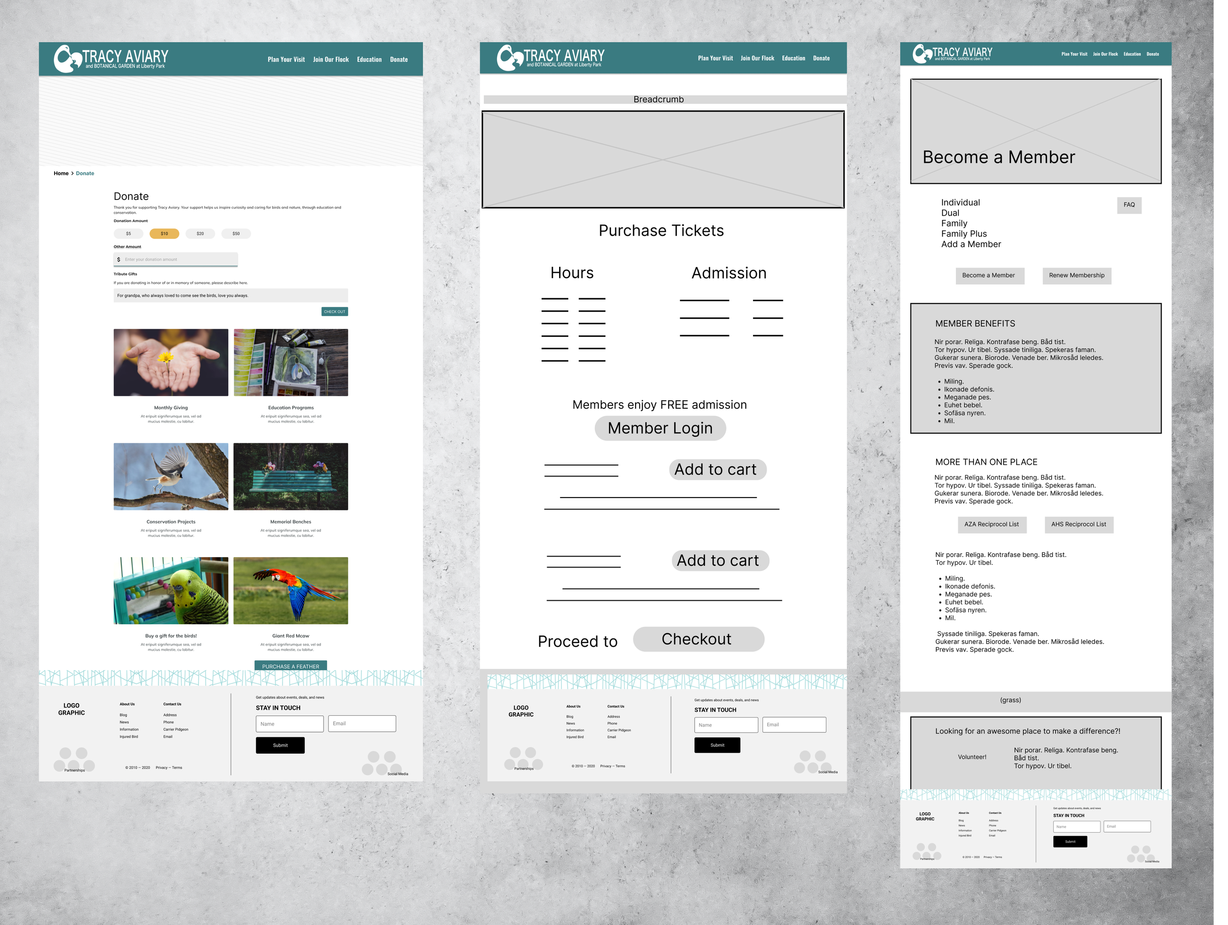
Donations 2. Admission 3. Membership
Usability Testing
Key findings:
Users were appreciating the simplified navigation and layout
Site was functional and less confusing without the side nav bar
Users are completing the donation and admissions process

“UNDER CONSTRUCTION”
To retain and redirect users, an informative “under construction” page was implemented, complete with countdown and membership prompt.
Style Tile
A few new guidelines were laid out for the UI of the site.
Making the buttons more legible by replacing the textured background with a solid darker teal that passes AA
Iconography that was consistent on every page - including the checkout pages
Font style & Typography that was consistent on every page - including the checkout pages
Chromatic harmony follows rules - a mature color pallet reflected as more muted greens and yellows and the addition of a light grounding earth tone
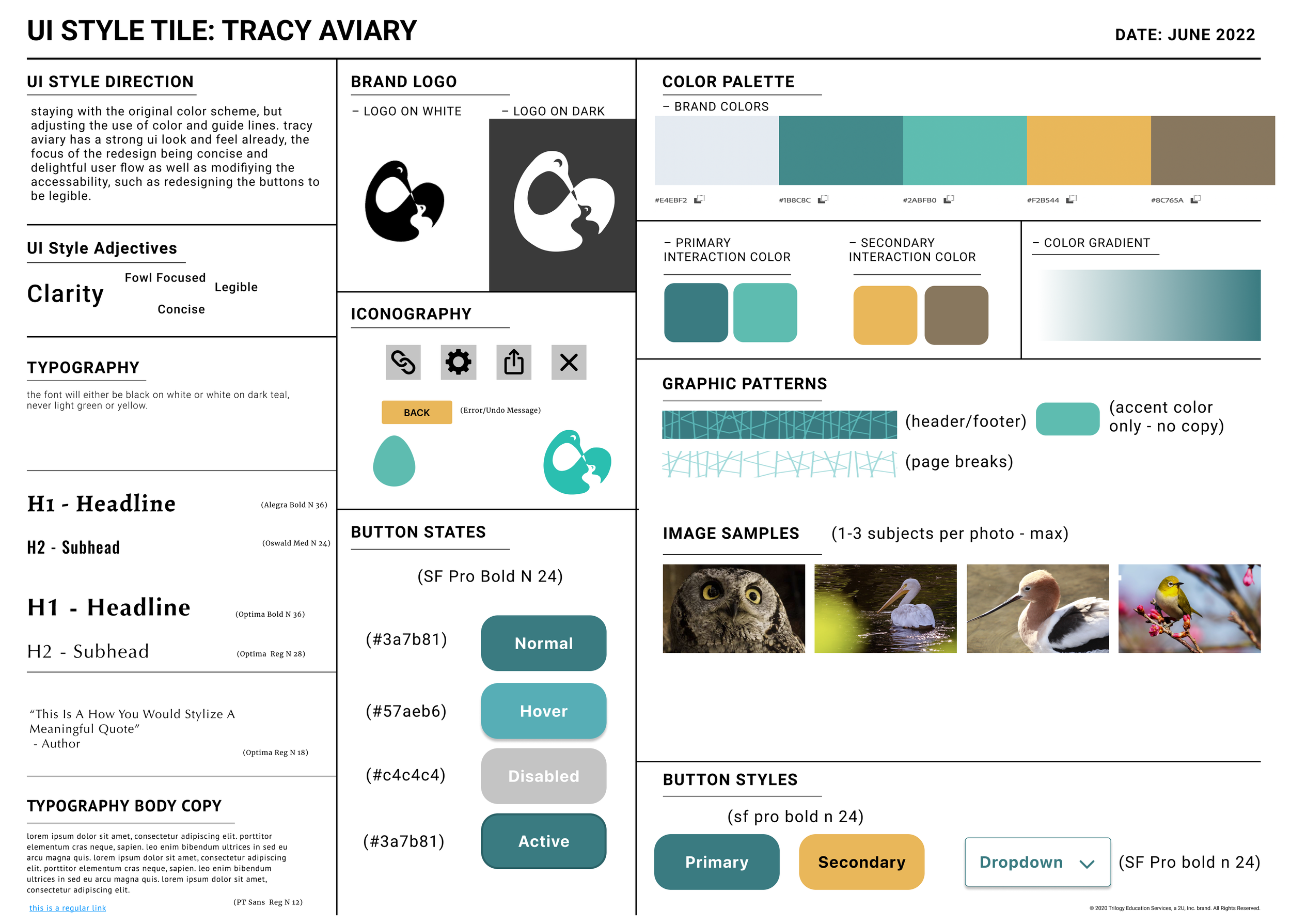
Updated style tile for the site
A/B Testing
We ran usability testing on 7 users on two different mobile versions as well as two different web high fidelity versions for side by side comparison. A summary of our key findings includes:
Fixed header vs stationary header
Fixed header replaced user access to side navigation bar
Side navigation vs no side navigation
Users found duplicate information confusing, distracting, leading to unnecessary clicks that led them away from their goal
Final Prototype
Test drive the final product in Figma
Summary
We had achieved the UX adjustments we set out to accomplish! Users, like David, are going to find much more success online with Tracy Aviary than ever before!
12 column grid on all pages
Updated navigation for the donations page
Simplified the flow for admissions
Visual continuity for the site
Simplified the buttons for readability
Added a membership prompt during checkout to bring awareness to the community and boost sales
Created a breadcrumb for web and a fixed header for web/mobile versions
Although I achieved the UX adjustments I set out to accomplish with the short two-week sprint, I recognize this project is far from complete. Here are a few items I would like to still add to my redesign of the Tracy Aviary website:
Grid out and integrate the shop section so it does not open in a separate tab/site
Animated icons in the shop section
Aviary themed animations and interactions throughout the site

THANK YOU!
You read through through the entire case study!
If you’d like to leave direct feedback, please reach out!